


Kaleidoscope watches


Traditionally, luxury watches have been most comfortable with classic shades, with a few notable exceptions. Now more brands are exploring the spectrum as a form of differentiation or to convey a message. New releases from SIHH 2019 confirm that colour rules.
What better way to brighten winter drab than Fine Watches in shades of blue, green, even pink, yellow or red? A splash of colour is an effective means of signalling a special collection, a limited edition or a watch in honour of a brand ambassador. Or simply standing out from the crowd. In a nutshell, there’s barely a brand today that doesn’t experiment with colour in some form. It’s even creeping backstage, into the movement, or mobilising R&D teams to push the boundaries with materials such as ceramic or titanium in unusual shades.
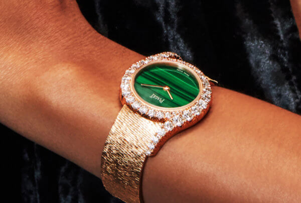
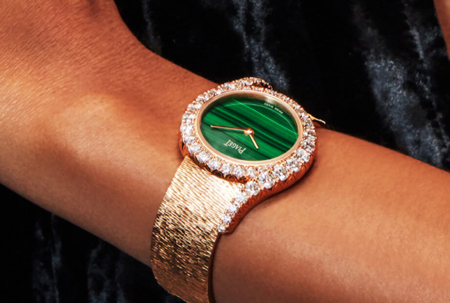
The first dabs of colour coincided with the trend for reinterpretations of vintage models, with brands taking care to respect the original chromatic codes. This triggered a wave of greens, blue, oranges and browns, in true 1960s and 70s style. Patek Philippe’s Aquanaut Chronograph is a good example; its orange hands and markers had tongues wagging at last year’s Baselworld. Closer to home, at SIHH 2019 Piaget left no doubt as to its attachment to these vibrant shades, including with the latest Limelight Gala, with gorgeous bands of colour on its deep green malachite dial, not to mention the cerise tones taking hold of the Possession watch.
True blue
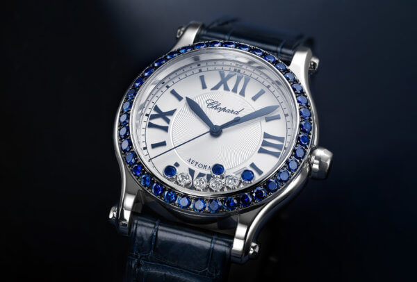
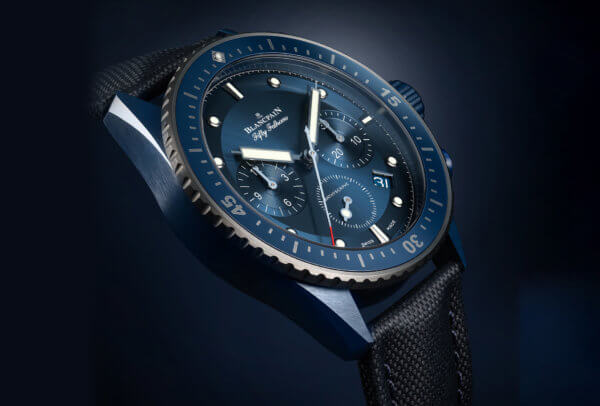
First mention, however, has to go to blue, a hugely popular shade and now a classic. Between last year’s crop of new releases and the styles unveiled in Geneva in January, examples of “cool blue” are legion – starting with Panerai which came to SIHH with a Submersible Guillaume Néry Edition complete with a blue ceramic bezel. Carrying on the blue theme, last year’s Happy Sport Blue Edition by Chopard swapped diamonds for sapphires, while the IWC Tribute to Pallweber in honour of the Manufacture’s 150th anniversary opted for a blue lacquered dial. At SIHH, Vacheron Constantin gave the blue treatment to its new Fiftysix collection, and Jaeger-LeCoultre introduced magnificent blue enamel guilloché dials to its Master Ultra Thin collection. Green is another shade making inroads at watch brands. This month we’ve seen it in khaki, part of the vintage-inspired 1858 line from Montblanc, and in translucid Murano glass on the extraordinary Medusa clock from MB&F + L’Épée 1839. There’s also some stealthy green camouflage creeping into the Audemars Piguet Royal Oak Offshore line, and a very British green brightening the dial of the new Spitfire Chronograph in bronze.
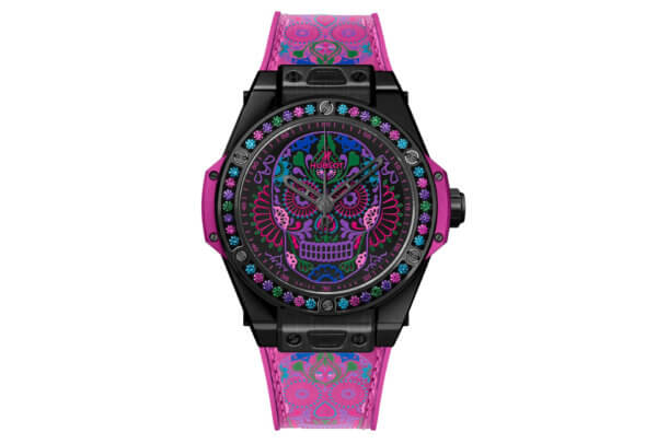
Jewellery watches have long made spectacular use of colour combinations. Last autumn, for example, Parmigiani teamed up with Gübelin Jewellery to create a Tonda 1950 that’s smothered in rubies. In addition to the 84 stones around the mother-of-pearl dial, this limited edition stands out for a red lacquered oscillating weight, a first in the history of Parmigiani. The watch was designed by Anne-Laure Parmigiani, taking the natural inclusions in a ruby as her starting point. She describes how “drawing inspiration from the inner world of the ruby was a fascinating experience. The result is a feminine timepiece that intuitively reflects the refined elegance of the pieces from Gübelin Jewellery.” More rubies, this time paired with diamonds, can be found on the new interpretation of the Tank Chinoise which Cartier brought to SIHH 2019. Over at Hublot, rare Paraíba tourmalines take pride of place on the Big Bang Paraíba. They follow on from last October’s highly remarked-upon Big Bang One Click Calavera Catrina, which rolled out a rainbow of 42 sapphires in honour of Mexico’s festive Día de los Muertos.
Any colour you like...
Once the gates are open, even colours that aren’t the most obvious fit for a Fine Watch can forge ahead, provided they align with the brand universe. Richard Mille has followed up on a red and yellow RM 67-02, created for brand ambassador and fast-rising tennis star Alexander Zverev, with an entire candy factory. Typically, the brand emphasises high-tech materials with a combination of Carbon TPT® and Quartz TPT® for cases in multiple original hues. They include a completely new shade of turquoise that took a full year to perfect, as showcased on the RM 07-03 Myrtille.
Once the gates are open, even colours that aren't the most obvious fit for a Fine Watch can forge ahead.
The (colour) field may be wide open, it’s still important to bear the target market in mind as individual shades don’t always have the same signification from one culture to another. In China, for example, as well as some Western countries, red is associated with joy whereas green is considered unlucky. In the Islamic world, on the other hand, green is a sacred colour, that of the Prophet, and therefore highly regarded. Some timely research into the hidden meaning of yellow or blue could prevent customers from seeing red!
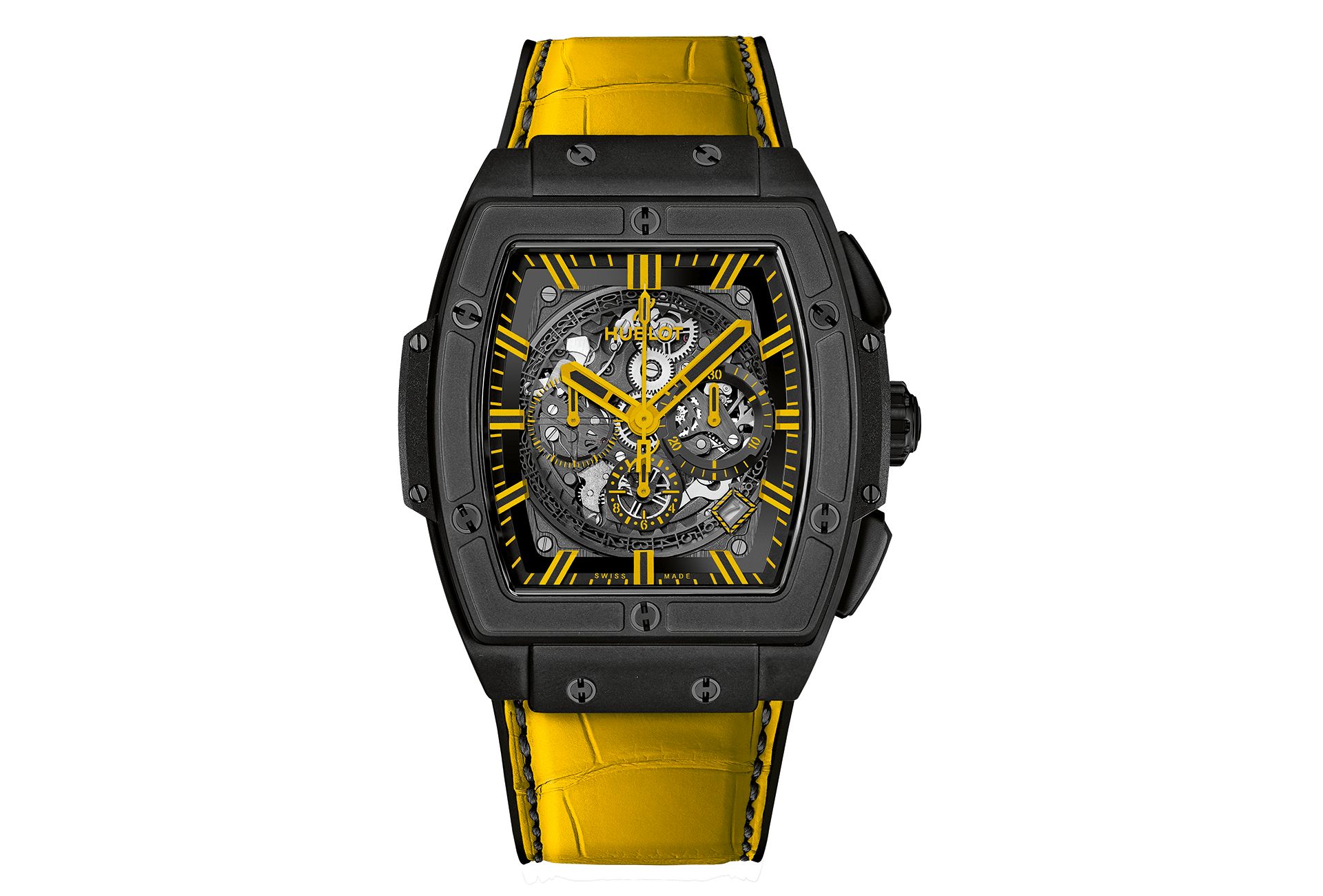
Red hot Hublot!
“Our customers don’t want their watch to resemble anything they might see somewhere else.”
What draws Hublot to bright colours? Is it the need to be bold, to be different?
Raphaël Nussbaumer, Product and Purchasing Director: We always aim to be first; to be different, unique. So few brands go for these vibrant colours, but we know our customers want a watch that looks totally different to anything they might see somewhere else, and we keep this in mind when designing our products. Our inspiration for the Big Bang Calavera Catrina, for example, came from the skulls, calaveras in Spanish, that are part of Day of the Dead celebrations in Mexico which is always a festive occasion, hence why they’re so bright and colourful.
Tell us more about the specificities or difficulties of working with these high-tech materials.
As well as being an early adopter of ceramic, Hublot has always been ahead of the game when it comes to vivid colours such as red. It’s extremely complicated to obtain a good red ceramic using traditional methods as the pigments become darker when heated. Our R&D department spent four years experimenting with combinations of temperature and pressure until it achieved the exact right shade. There then follows a long process of machining and polishing at the end of which we have an exceptionally hard material: 1,500 Vickers compared with 1,200 Vickers for conventional ceramic. Having mastered the basic shades, a whole new playground of coloured ceramic has opened up for Hublot watches.
Did the idea of colouring your watches come from the many Hublot watches that are set with coloured stones?
It’s true that stones are a means for us to introduce colour to our watches, such as the Big Bang Sapphire Rainbow and Sapphire Galaxy, but it’s not what brought us to actually colouring our watches.
Blue is for Bucherer
“Blue has always been Bucherer’s colour.”
Three years ago, the retailer launched the Bucherer Blue Editions collection of models by partner watchmakers, sold only in Bucherer stores.
How did this collection of only blue watches begin?
Jörg Baumann, Marketing and Business Development Director, Bucherer AG: Once we had the idea, we were able to simultaneously launch the first Bucherer Blue Editions in 2016: 14 exclusive timepieces which we created with nine world-renowned brands. Today’s collection features 31 watches, all exclusive to Bucherer.
What's the philosophy behind the collection?
Bucherer Blue Editions uniquely express the strong partnerships we have with renowned brands. They also underscore how important innovation is within our firm. It’s a lifestyle collection that customers will find only in our stores. It can also take unexpected forms, as it did with the Harley Davidson Blue Edition, a fully customised motorbike complete with a Karl F. Bucherer timepiece set into the tank.
Why blue?
Not only has blue always been Bucherer’s colour, it has numerous positive connotations too, such as elegance, harmony and the infinite. It’s a timeless, classic shade. Blue has also played an important part in the history of watchmaking. Blued hands were in use early on, and blue was the first colour used for watches. It represents the origin and at the same time the possibility of something new.
Who chooses among the many shades of blue?
Bucherer Blue Editions thrive on the creativity of our partners in coordination with Bucherer. It’s therefore their role to interpret the blue theme in their own Blue Edition, to create a variety of unique pieces. The most recent members of the family are shining examples of these different treatments of blue. Chopard’s iconic Happy Sport fascinates with its sapphire bezel. Meanwhile, H. Moser & Cie takes an unconventional approach by featuring blue not on the dial but very subtly on components in the automatic movement and on the strap lining.
The power of purple at MB&F
“Most watchmakers avoid purple because it isn’t stable.”
What if colour served to drive home a creative message? This is the road MB&F has taken with its Legacy Machine No2. “Ask people to name their favourite colour and they’ll tell you blue, or red or green, but rarely purple. Purple isn’t a conventional colour and even less so in watchmaking,” comments Charris Yadigaroglou, director of communication at MB&F, adding that most watchmakers avoid purple because it isn’t “stable”, tending towards blue or even green depending on the light. But as Yadigaroglou explains, “to us, this just makes it even cooler.”
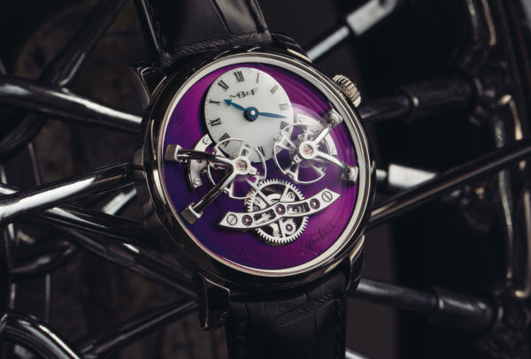
This isn’t the first time MB&F has picked purple. The first smatterings of violet appeared as of 2011, on the oscillating weights in models including the HM3 Frog Zr and the HM5 Carbon Macrolon, as well as the HM8 Only Watch. Last November, then, the brand launched a 12-piece limited edition, the LM2 White Gold Purple. The rich purple which covers the entire “face” of the Machine echoes the equally non-conformist LM2 movement. Devised by Jean-François Mojon and decorated by Kari Voutilainen, the LM2 calibre incorporates two fully independent “flying” balances and two escapements whose rates are averaged by a central planetary differential.
